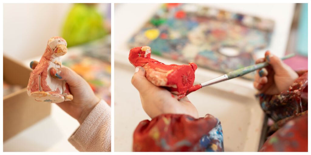
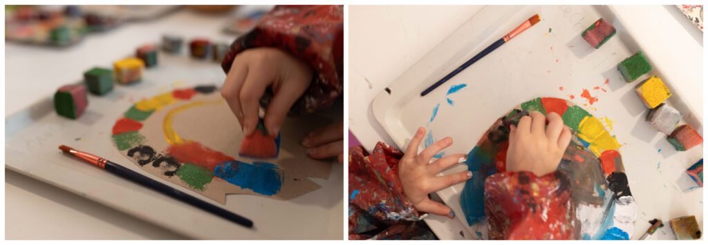
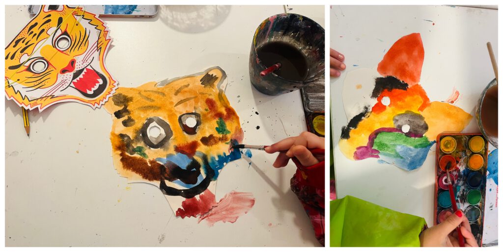
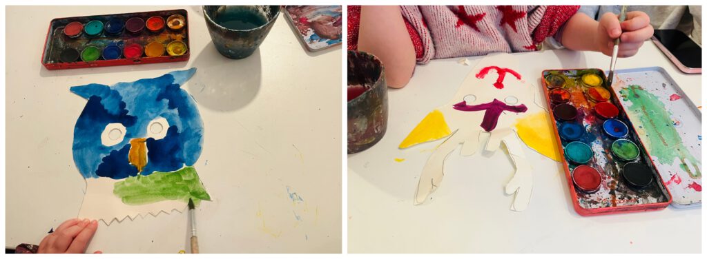
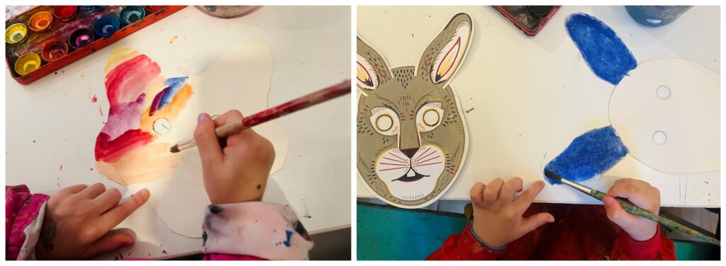
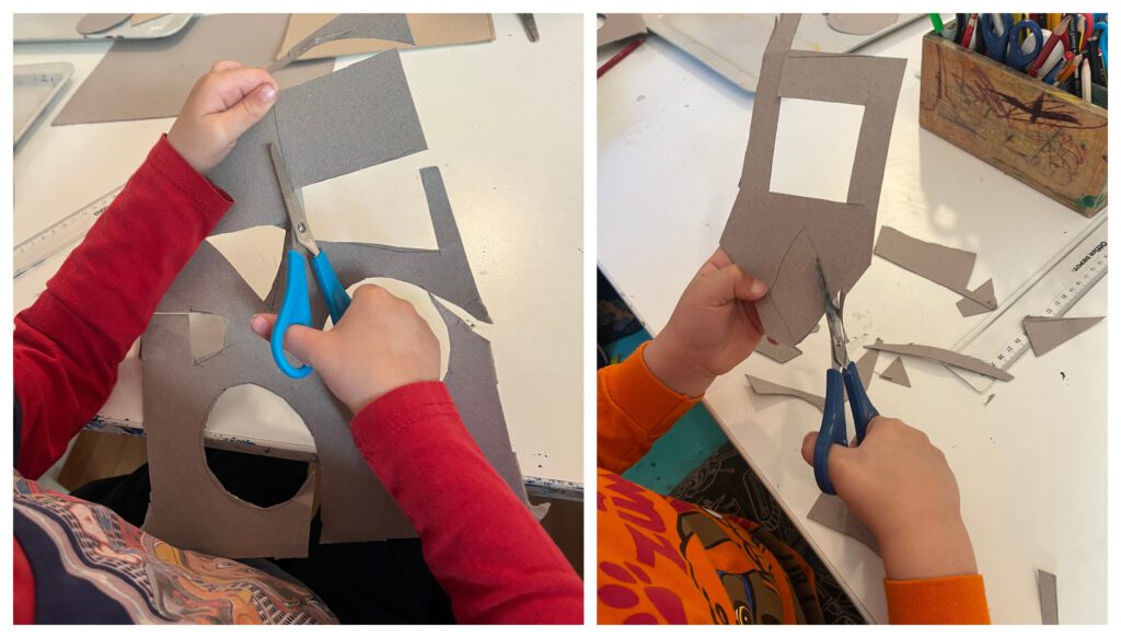
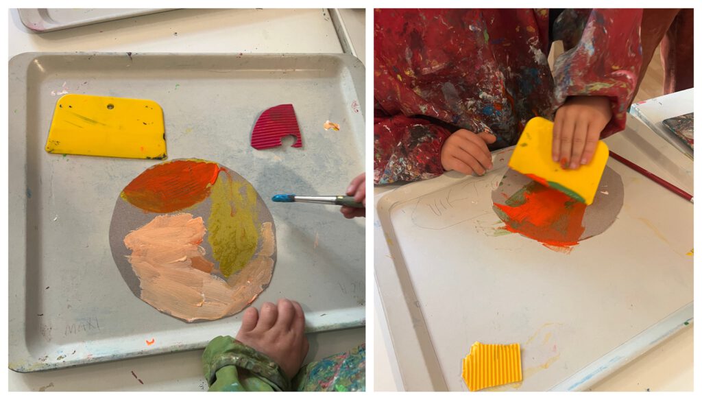
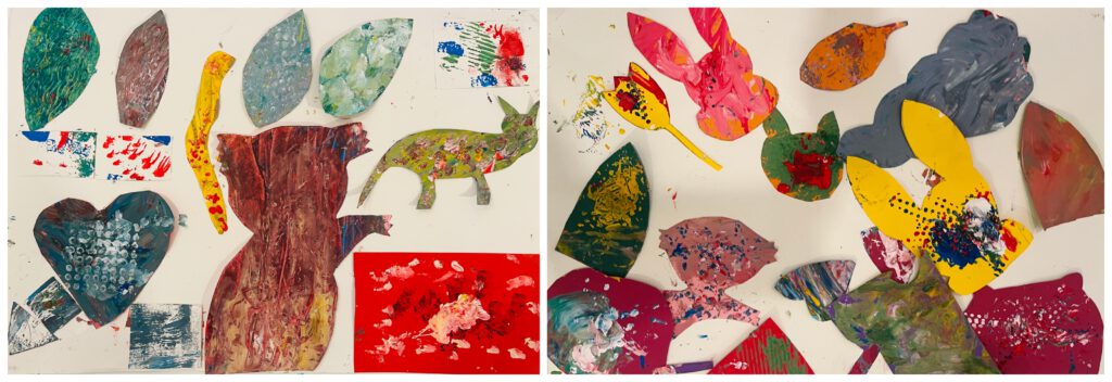
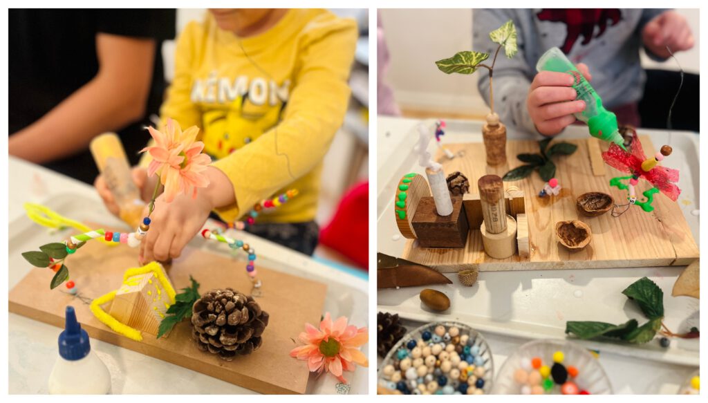
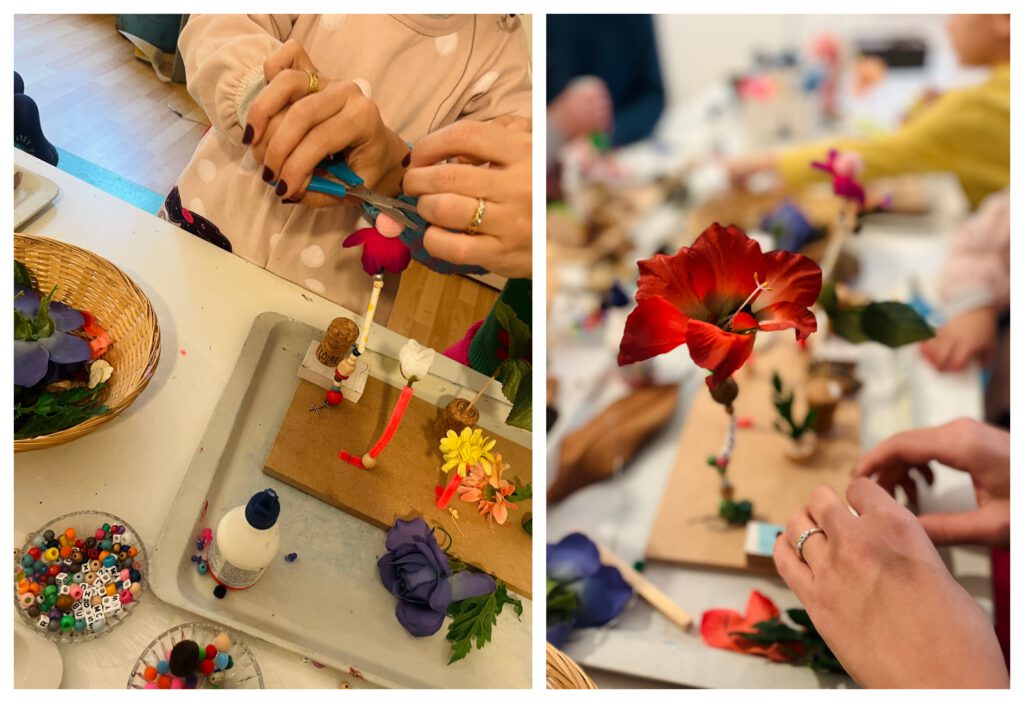
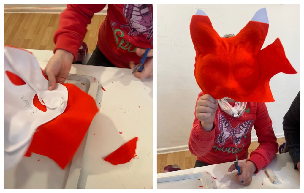
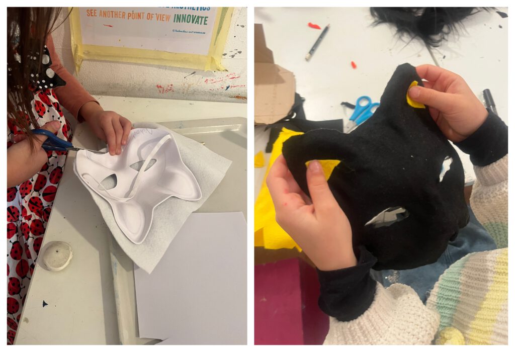
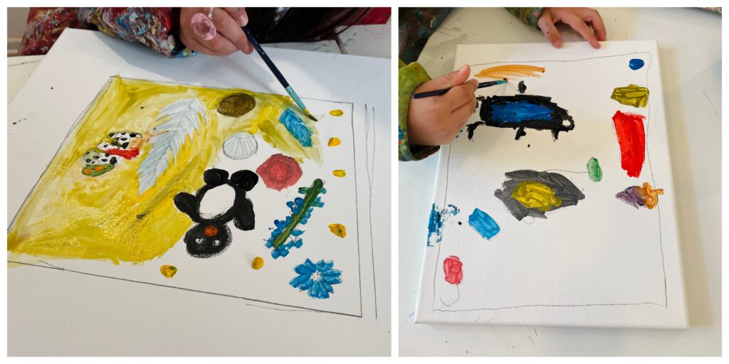
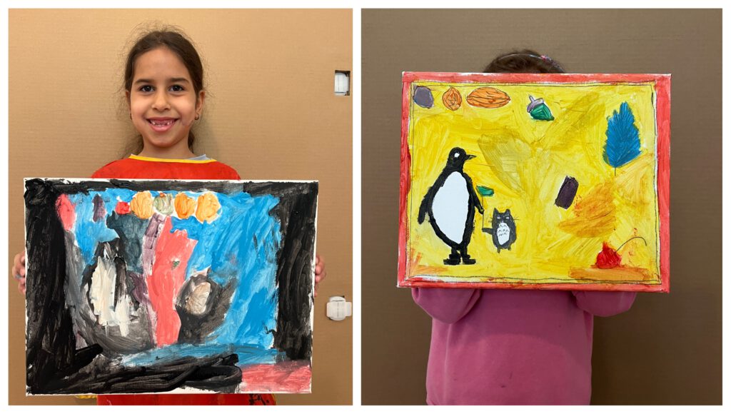
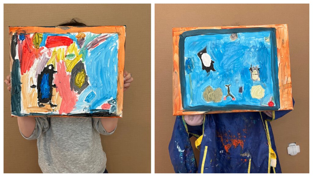
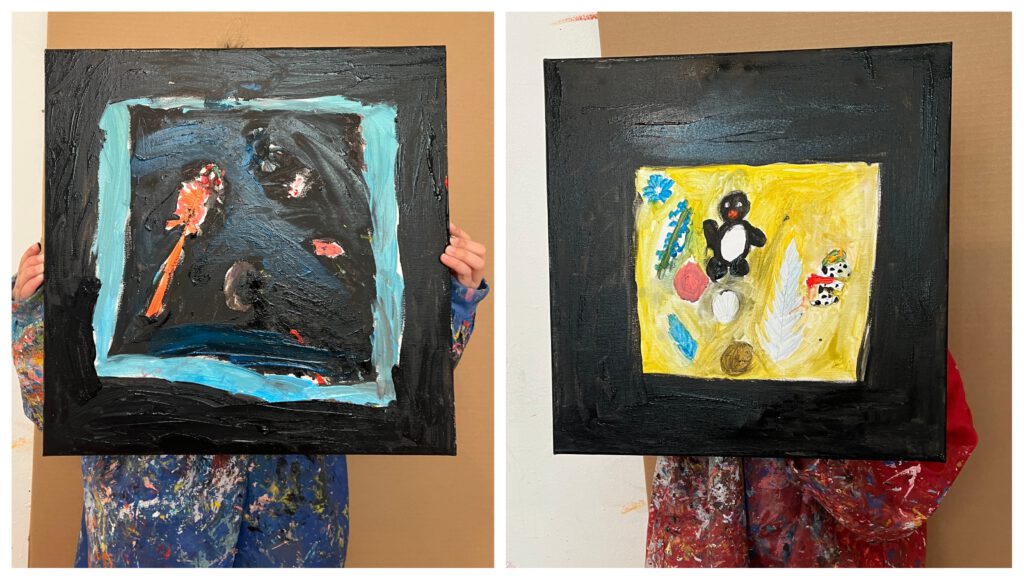
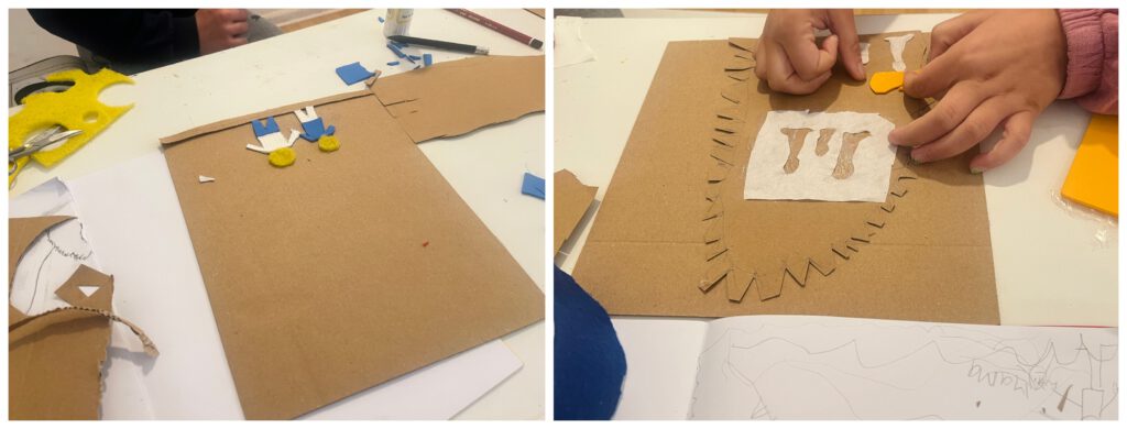
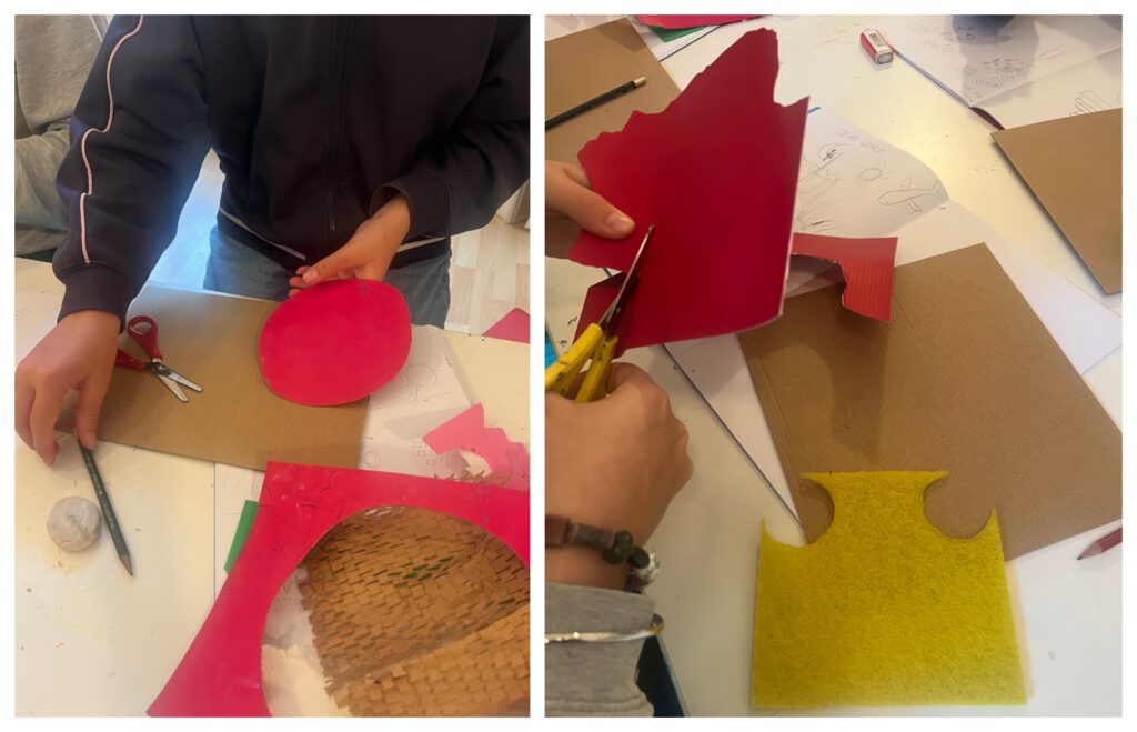
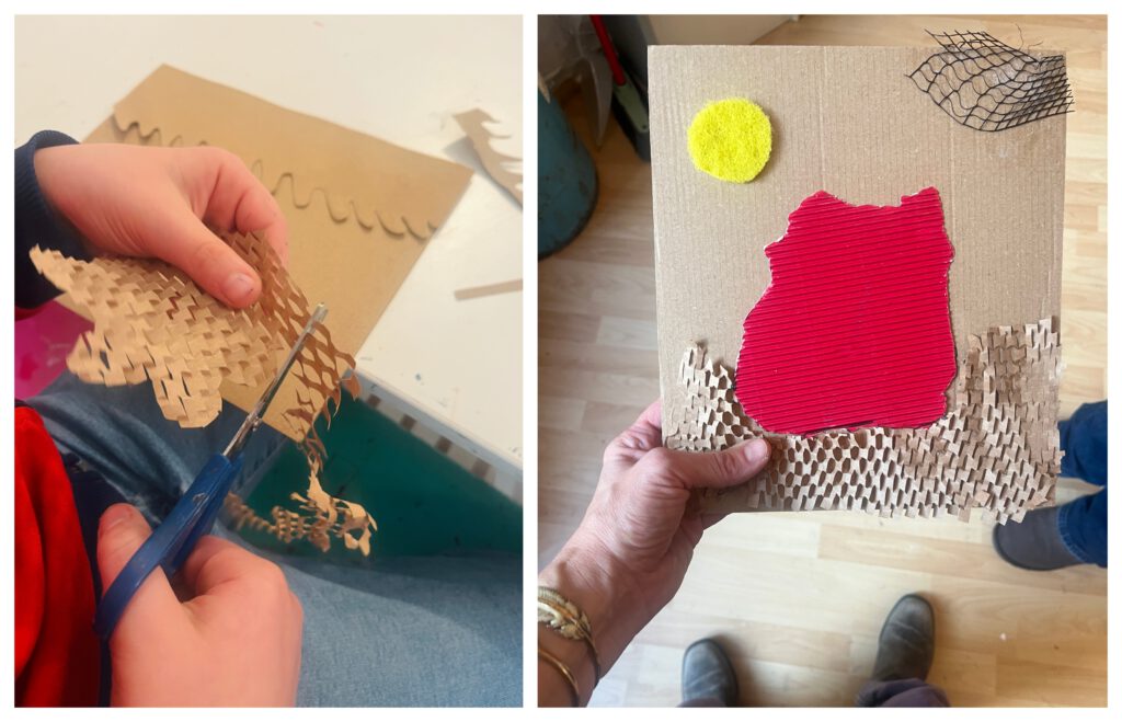
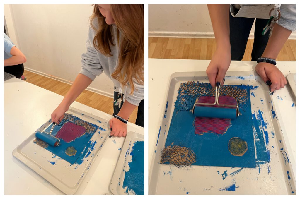
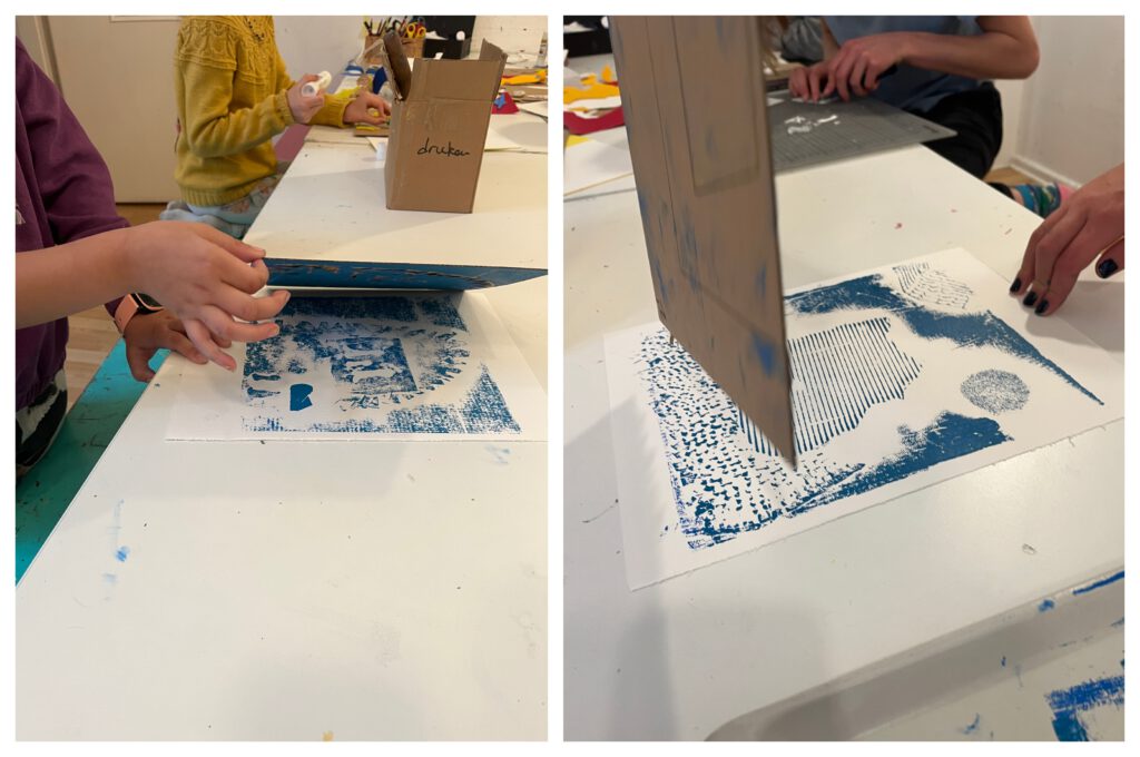
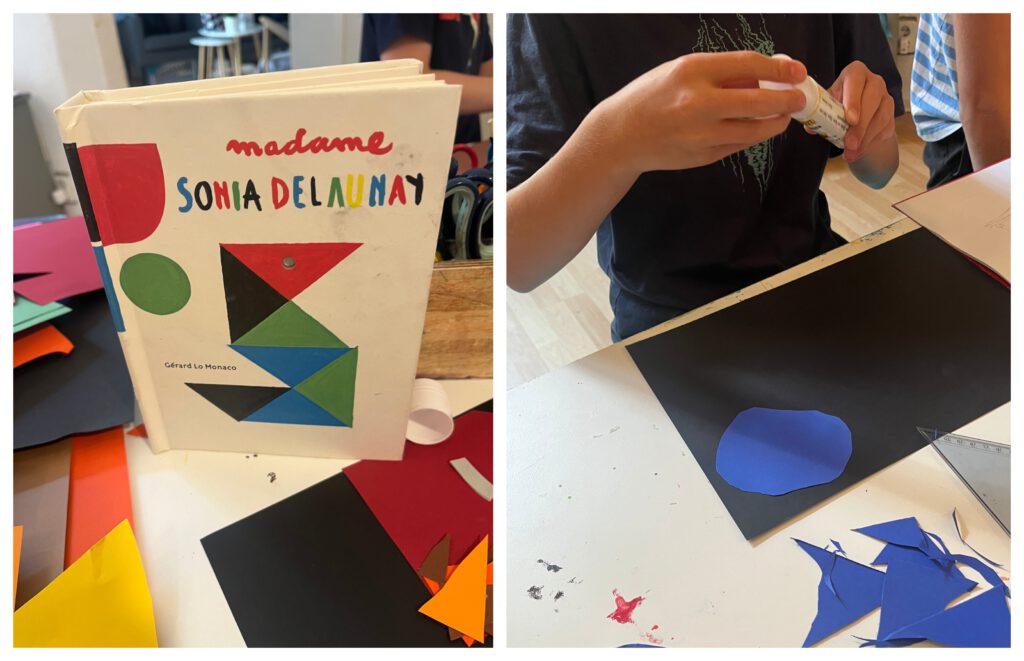
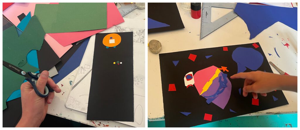
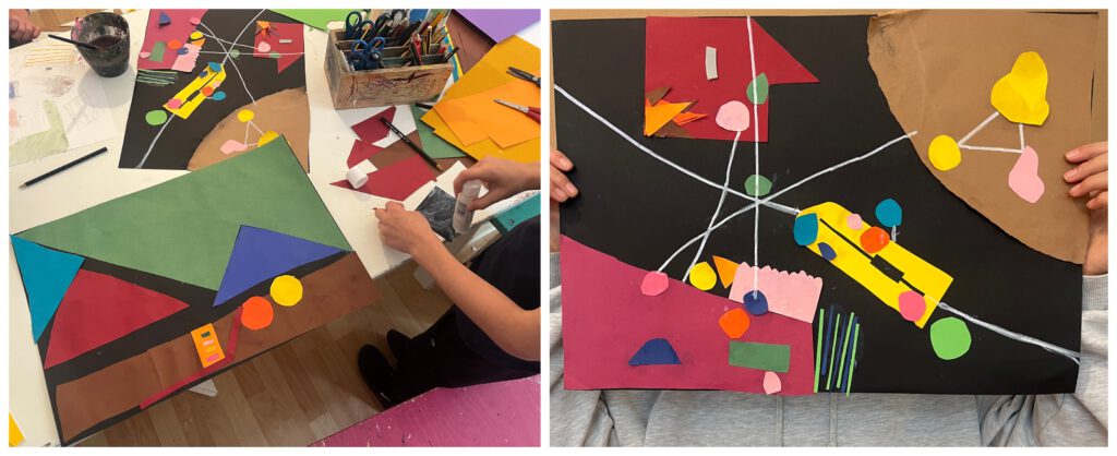
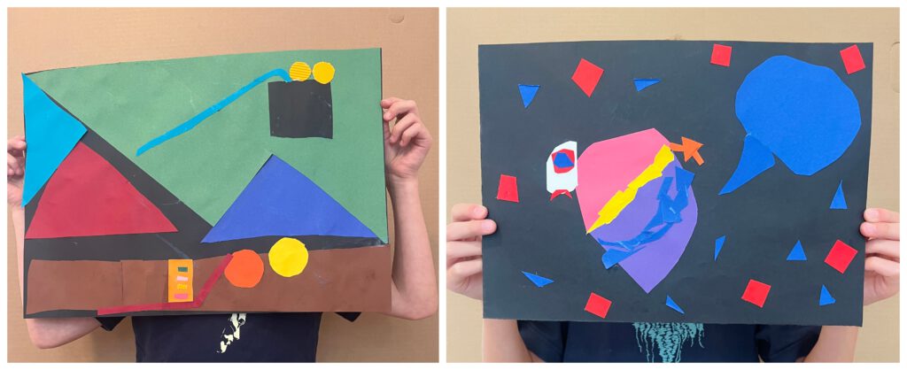
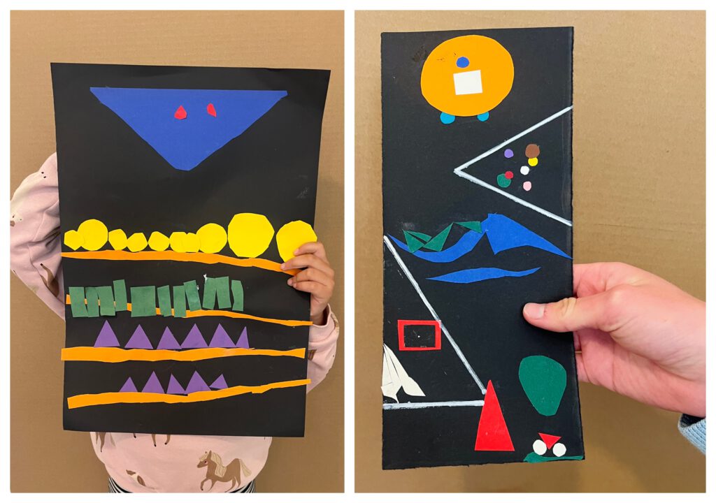
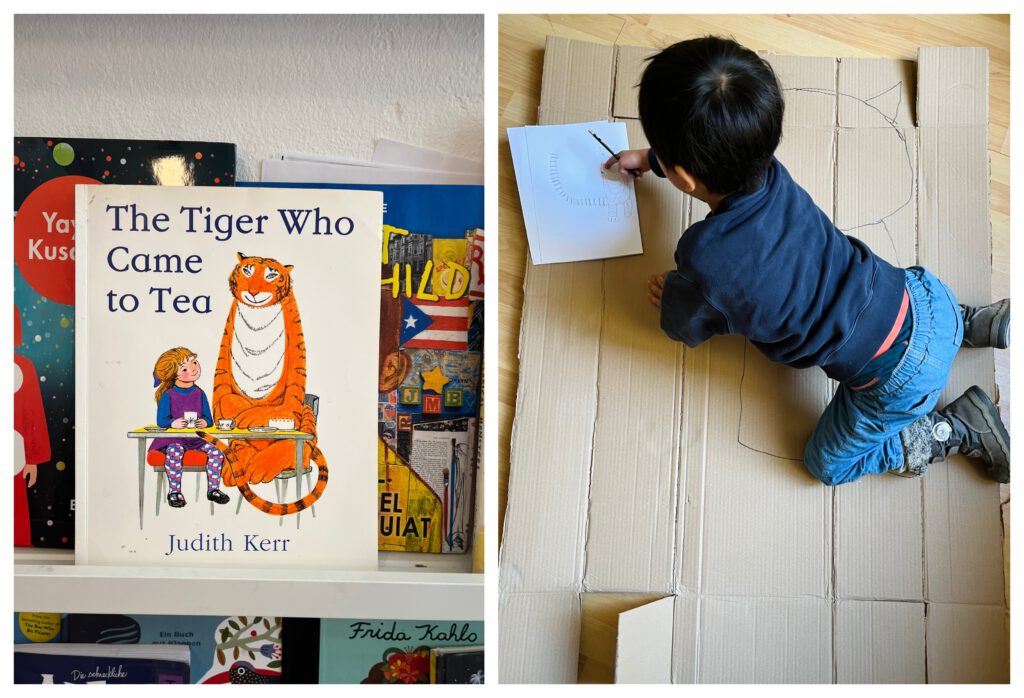
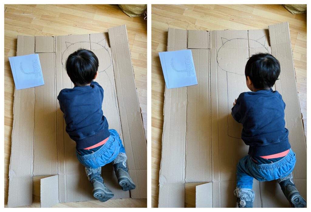
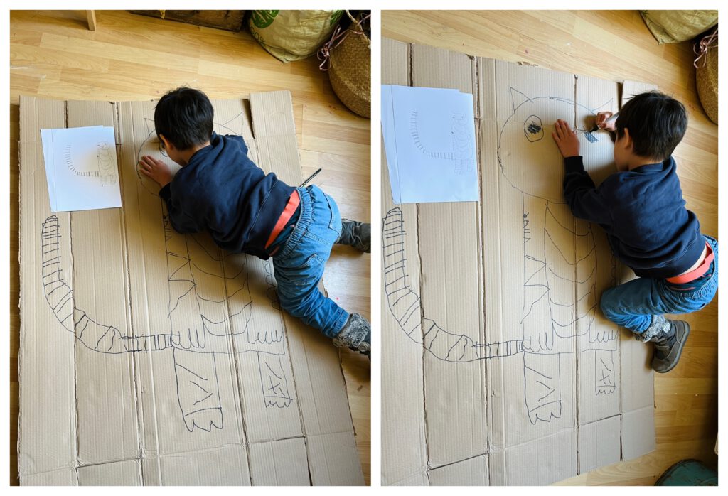
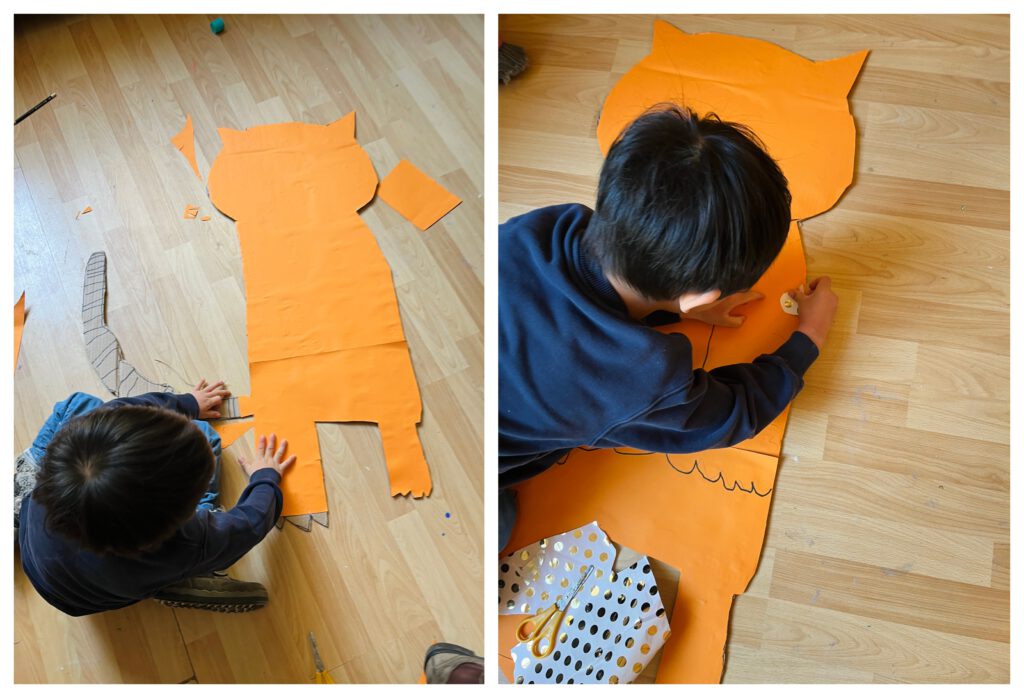
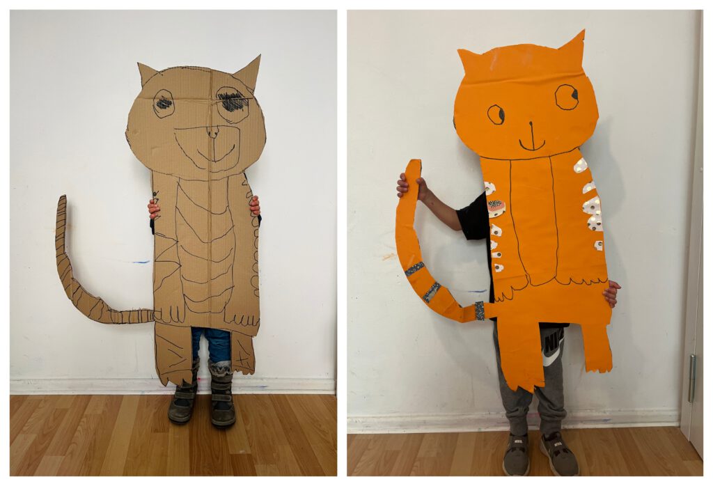
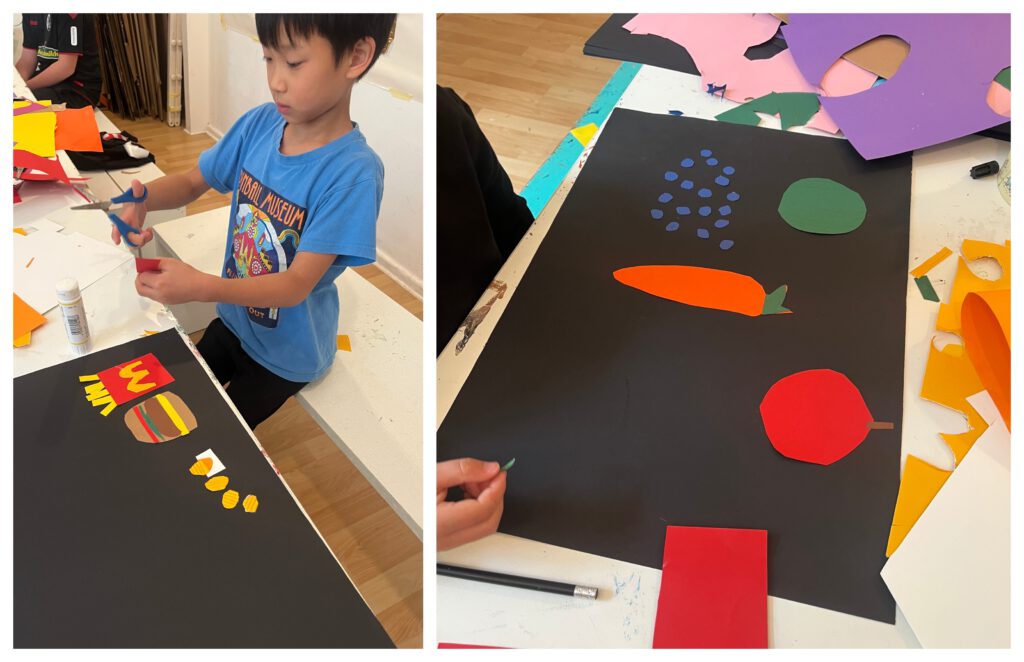
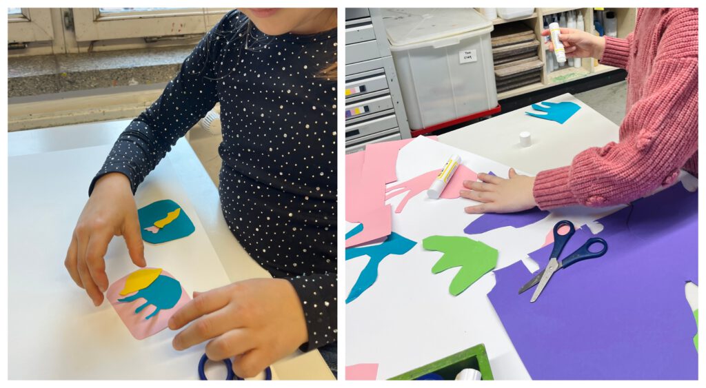
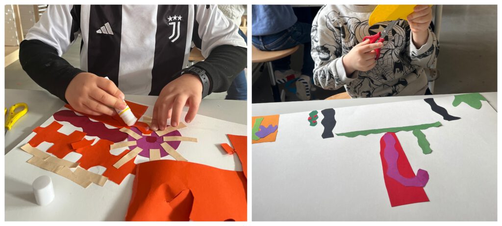
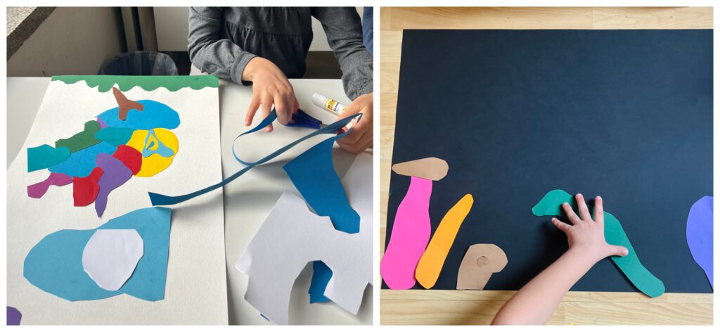
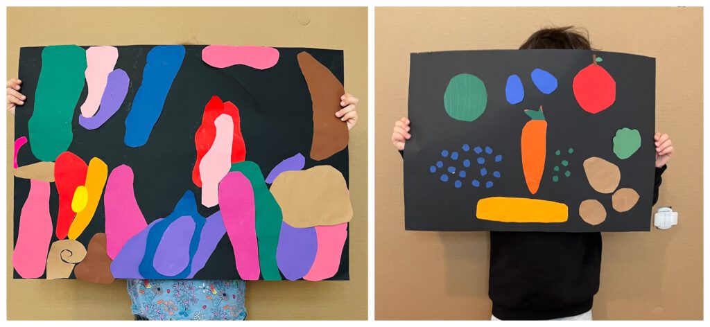
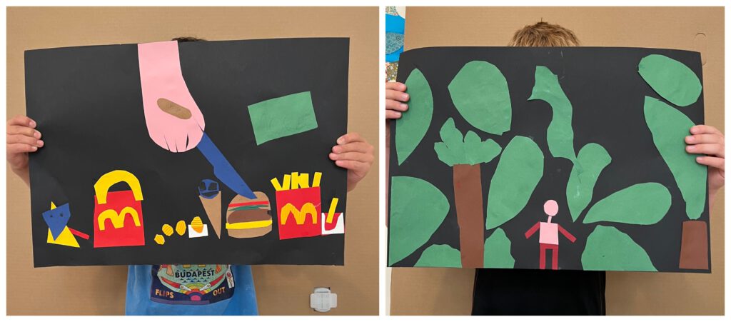
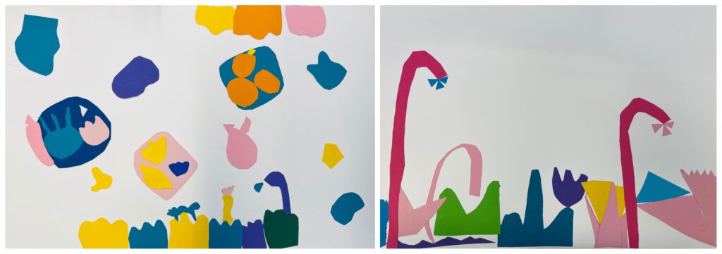
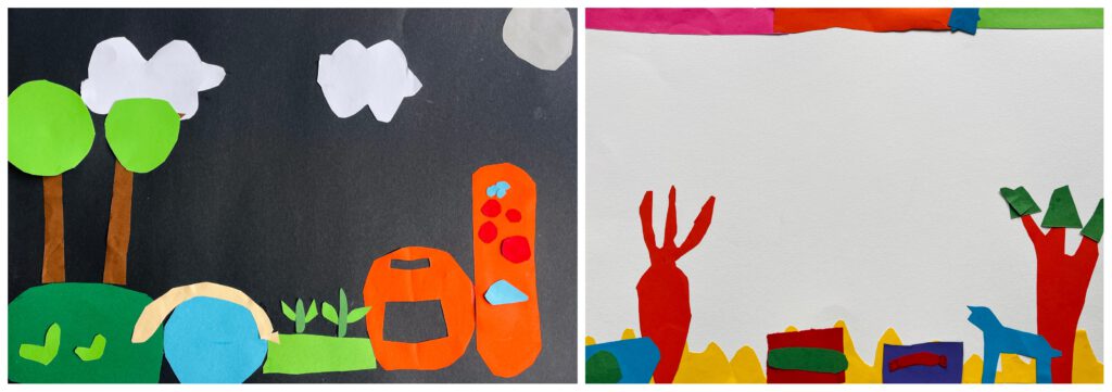
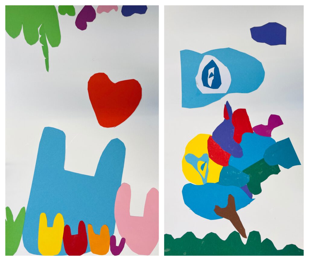
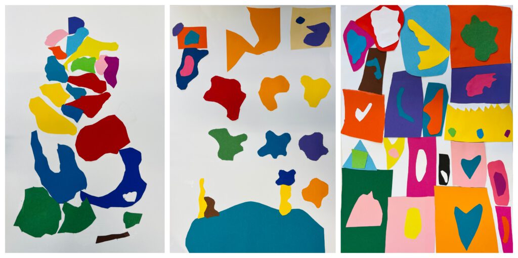
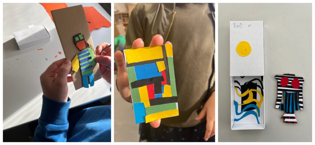
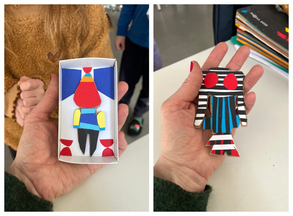
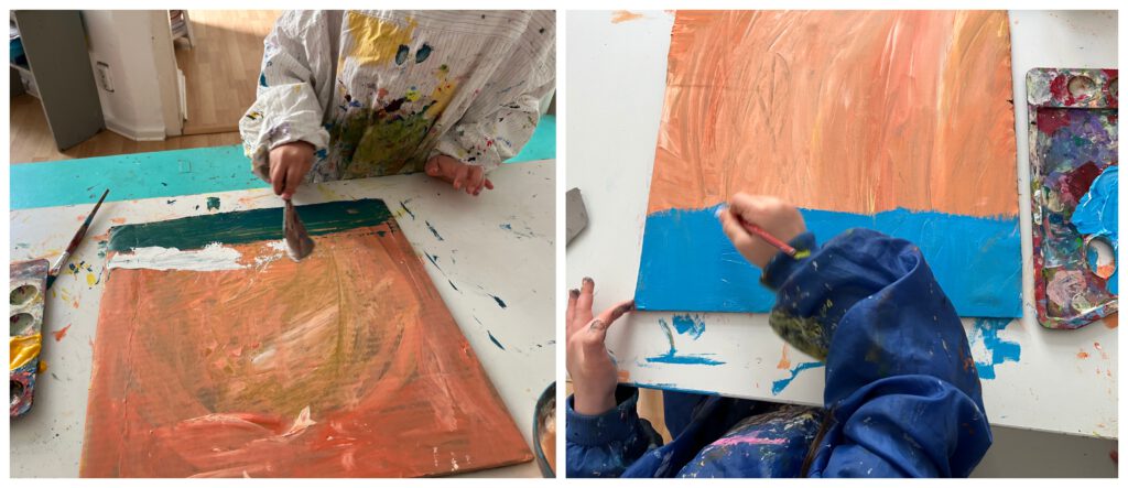
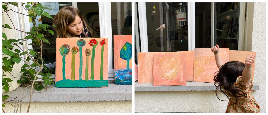
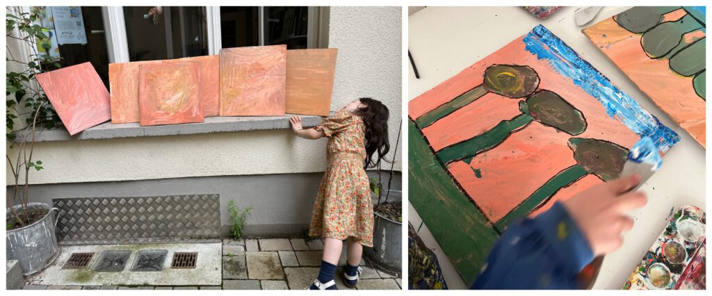
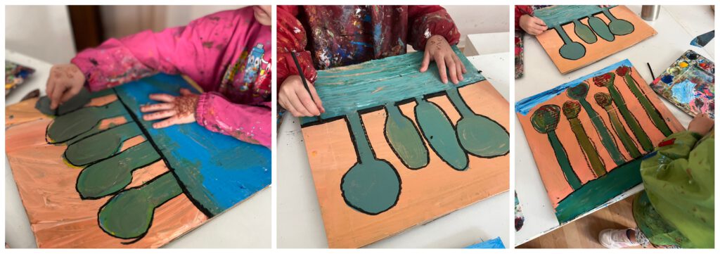
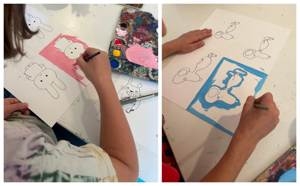
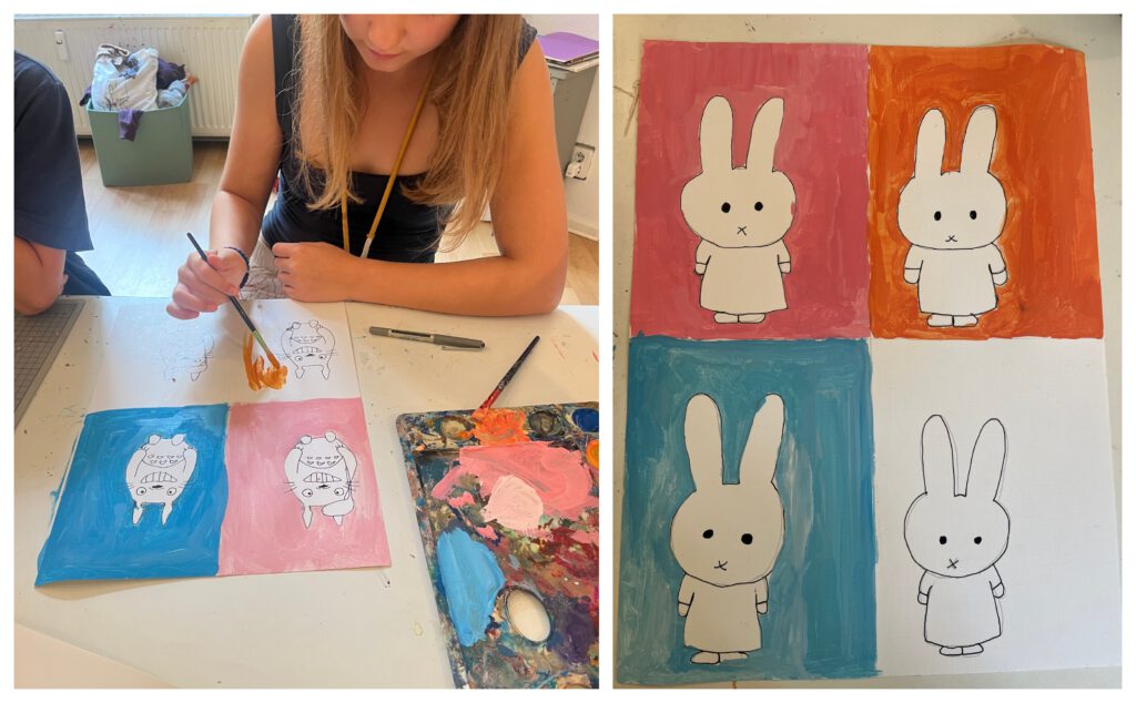
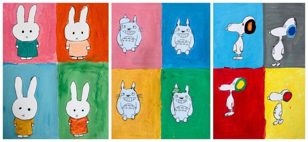
We had an amazingly loving birthday celebration of a 9 years old girl. Hip hip hurray!
Art classes in Berlin
by artnuts
We had an amazingly loving birthday celebration of a 9 years old girl. Hip hip hurray!
by artnuts
by artnuts
by artnuts
by artnuts
Not the first time I am posting this sort of project but every time it is unique and I am impressed by the work. You can read about it in some posts bellow.
by artnuts
This sort of painting is quite an easy straightforward task as it comes with a reference. It was a fun project and kids were deeply into it.
by artnuts
In our PYP Unit “Role models” Grade 2 discussed Joan Miró. We broke his colours down to basics, black and white and his shapes to little potatos that are sometimes overlapping opening possibilities for the third shape and a new colour. We added lots of soft lines.
by artnuts
In the PYP Unit we touched the topic of sustainability. Our key figure was Marina Strocchi, an Australian painter who uses divisions and patters in her paintings talking about land, harvest, ethnography, the coulours of dry land, red land, of home. I love her works to bits!
So the plan was to get inspired by Marina Strocchi and try to use this in our project of sustainable transportation. The work was clearly lined up:
1. Draw the city transportation just anywhere (students can rotate their paper throughout their work to get the “every direction” effect. Think about how the transportation moves from A to B. Draw the inside, think about machinery.)
2. Draw the ground. Roads, water…
3. Think background. We are in the city. We will use city patterns the way Strocchi uses her land patterns. So trash cans, city lights, mail boxes, birds, dog poo.. anything city like goes.
4. Divide the white in between the road areas. Liminal spaces. Fill them in with your patterns.
5. Trace the pencil with a stick and a black ink and then colour using red, blue and yellow ink.
by artnuts
Here we go again with beautiful printing. Again I love the printing plates more than the results. However this was fun as it always is.
We’ve made the printing plates out of various materials to leave various traces. We added all the colours at the same time. Because we don’t like to complicate.
by artnuts
Connecting to our PYP Unit ‘Cycles in nature’ we took a pick into the life of colours on our beautiful classroom poster of a colour wheel designed by Johannes Itten. This was Grade 1 and children are small so to take off we simply did some skatches of winter and summer, connecting the colours to the seasons.
When the children understood which colours belongs to which group they were asked to cut 3 warm and 3 cool shapes out of scrap paper and glue them on a bigger white paper. Each table got a plate of gouache colours: red, blue, yellow and white for the light. By mixing them they painted some of their own shapes next to the glued ones. For finals they outlined them with black adding also some patterns here and there.
I found this lovely project at Small hands big art to whom I always turn to when stuck in uncertainty. A presto!